Audicambra

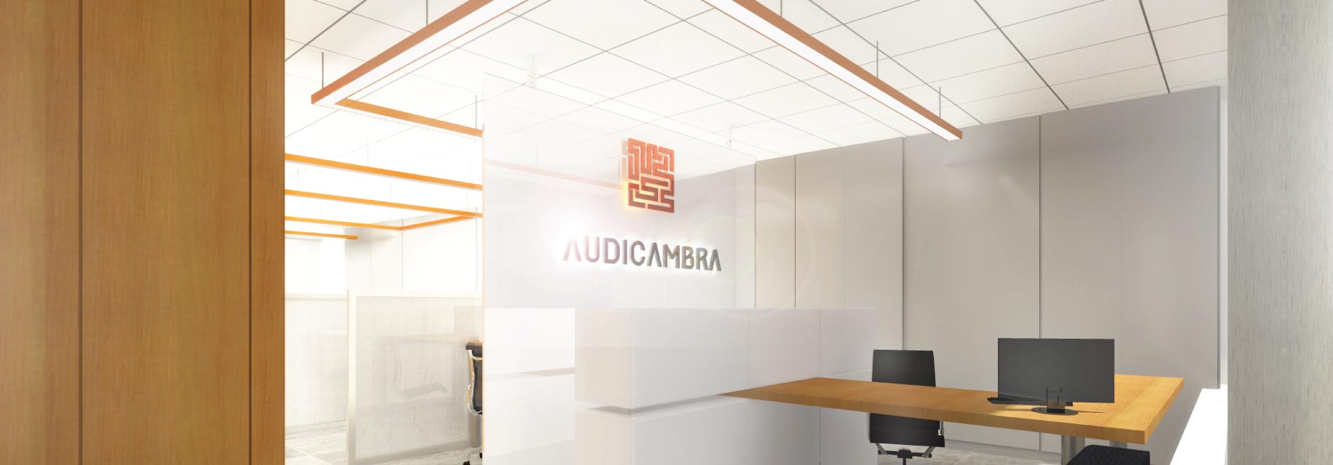
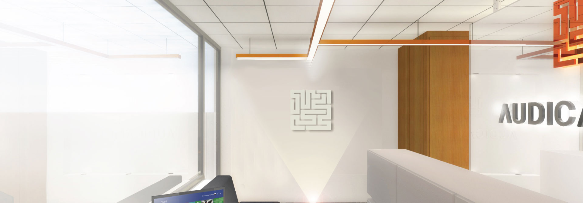
The new image of Audicambra presents a unique and exclusive style that is reflected in the dynamic lines of fashion and sense of growth and movement. In imagery, the labyrinth appears as a dynamic element, accurate and rational, vectors of the brand differentiation.
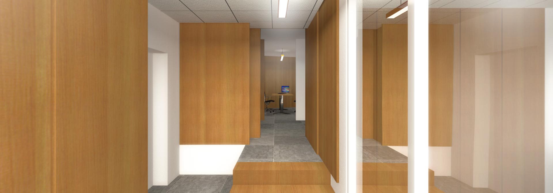
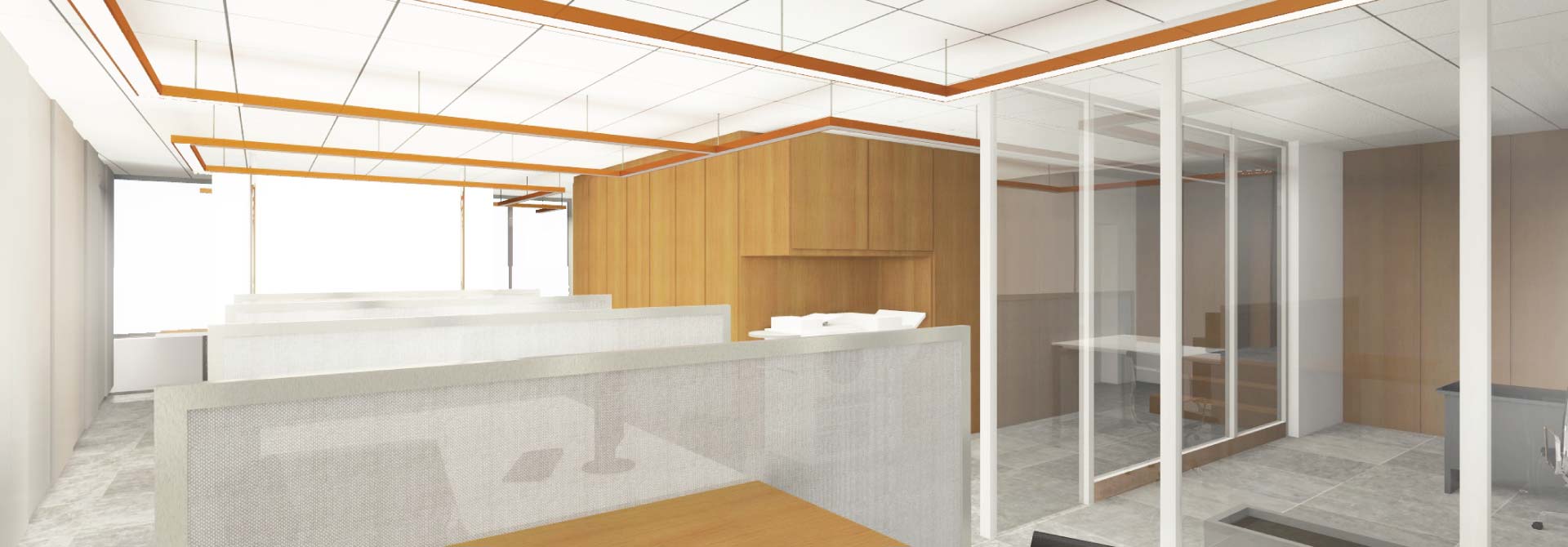
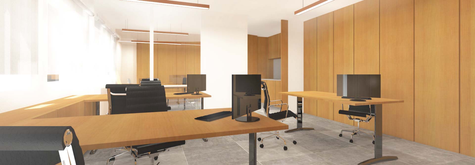
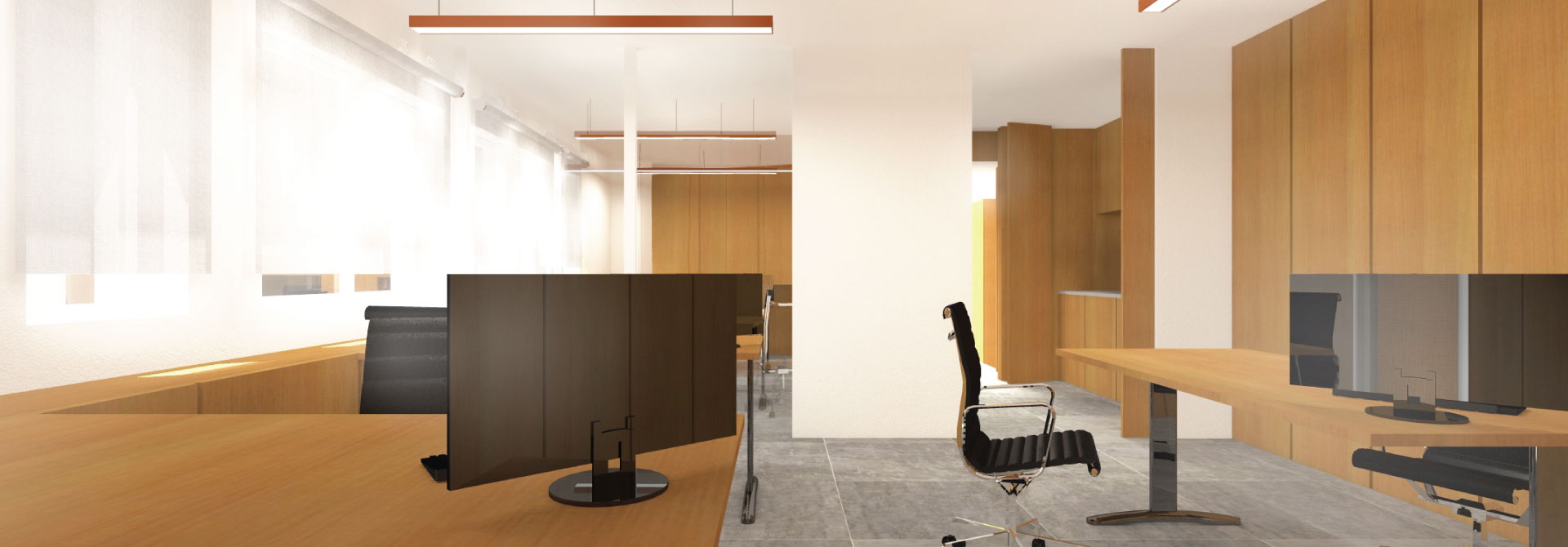
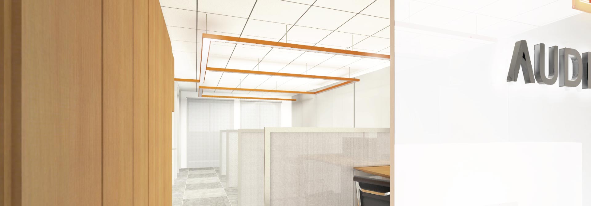
Intervention in POS intended to remove all accessory elements that would create entropy to the clear message that the brand intends to pass.
website
SHARE

